White Labeling
White labeling allows you to customize the Arvist platform with your organization's branding by configuring custom presets. Each preset includes a logo and color scheme that can be applied across the web application.
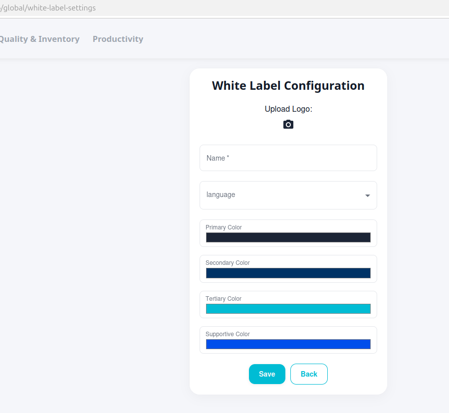
Accessing White Label Settings
To access the white label settings:
- Navigate to
/global/white-label-settingsin your browser- This is a hidden link not accessible through the sidebar navigation
- You must manually enter the URL or bookmark it for future access
NOTE: White labeling configuration requires appropriate user permissions.
Managing Presets
When you access the white label settings page, you can either select an existing preset or create a new one.
Default Preset
The platform includes a default "Arvist" preset with Arvist's branding. This preset cannot be modified or deleted.
Selecting an Existing Preset
To apply an existing preset:
- Choose a preset from the list of available presets
- Click Save to apply the selected preset
Creating a New Preset
To create a custom preset:
- Click Create to start a new preset
- Fill in the following information:
- Preset Name: A unique name for your preset (e.g., "Company Brand", "Dark Theme")
- Logo: Upload your company logo for the web application
- Color Scheme: Configure the four color values (see below)
- Click Save to create and apply the preset
Logo Upload
Upload your organization's logo to replace the Arvist branding in the web application:
- Accepted formats: PNG, JPG, SVG
- Recommended size: 200x50 pixels
- Use a transparent background or ensure the background matches your interface colors
- The logo appears in the navigation header and throughout the application
Color Scheme
Customize the platform's color palette to match your brand guidelines. The platform uses four distinct colors that serve different purposes throughout the interface:
Primary Color
- Main brand color used for core branding elements and the primary theme
- Provide as hex color code (e.g., #2563EB)
- Ensure sufficient contrast with white text for accessibility
Secondary Color
- Used for dashboard visualizations, charts, and data displays
- Applied to safety score gradients, graph elements, and backgrounds
- Provide as hex color code
- Should work well in gradients and data visualization contexts
Tertiary Color
- Primary interactive color used throughout the application
- Applied to buttons, tabs, links, checkboxes, active states, and borders
- Most commonly seen color for user interactions
- Provide as hex color code
- Should have good contrast for interactive elements
Supportive Color
- Used primarily for hover states on interactive elements
- Provides visual feedback when users hover over buttons, links, and other tertiary-colored elements
- Provide as hex color code
- Should complement the tertiary color and provide clear visual distinction on hover
Best Practices
When creating a custom preset, consider the following:
Logo
- Use clean, simple logos that remain legible at small sizes
- SVG format is preferred for scalability
- Ensure logos are visible against your chosen background colors
Colors
- Stay true to your official brand guidelines
- Maintain WCAG 2.1 AA contrast ratios for text and interactive elements
- Ensure tertiary and supportive colors work well together for interactive states
- Choose secondary colors that work well in charts and gradients
- Test all four colors together to ensure they create a cohesive visual experience