Dashboard
The Safety & Compliance dashboard is a comprehensive view of all safety-related metrics, data-aggregation, and most-recent incidents. Below is a detailed explanation of each component on the dashboard.
Charts and Metrics
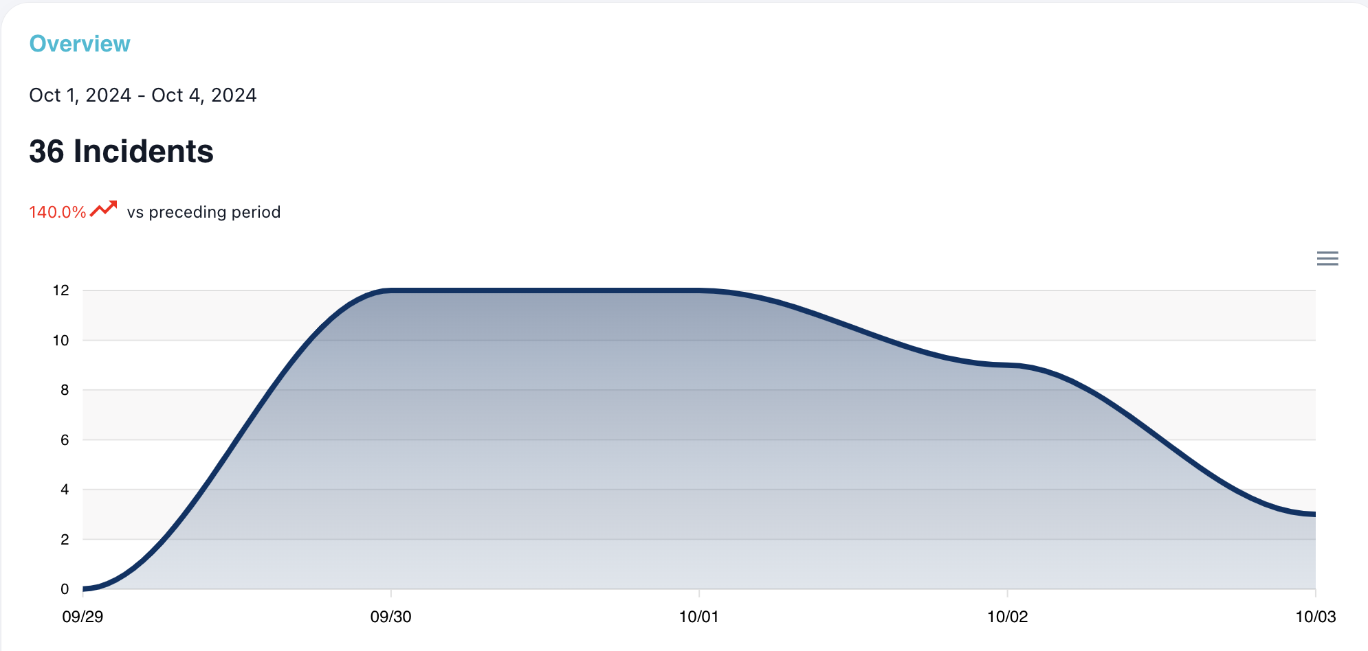
Overview
The overview chart is a line chart that presents an at-a-glance view of the number of incidents per day over the filtered time frame. Hovering over a specific date will provide the exact incidents count. The total incidents count for the time frame is displayed in bold, along with a color-specific percentage and icon comparing the current number of incidents with the past number of incidents (also based on the time frame). Red means there are more incidents currently than in the past, green means less incidents comparatively.
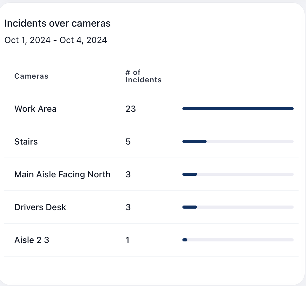
Incidents Over Cameras
This chart provides more insight into where the most incidents are commonly occuring within the warehouse. It is organized by camera name with the number of incidents per camera, sorted by most to least incidents, which can provide more insight into more hazardous areas of the warehouse.
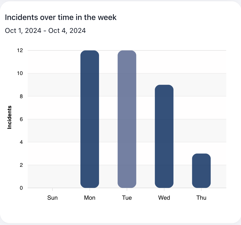
Incidents Over Time in the Week
This chart visualizes the average number of incidents per weekday during the selected time frame. This view can provide more insight into safety hazards that occur on specific days of the week and narrow down busier days that might lead to more safety hazards, specific employees working during those times, etc.
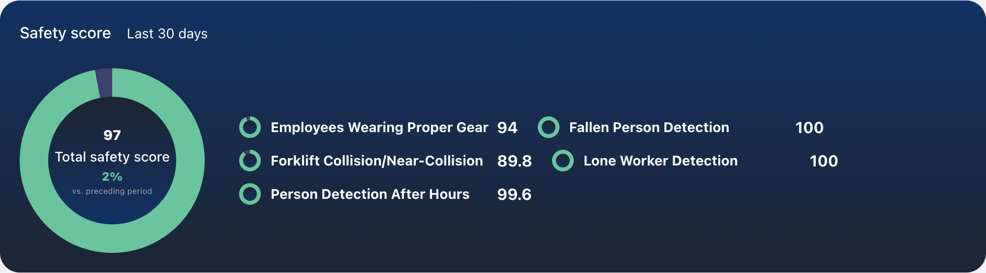
Safety Score
The safety score uses an internal algorithm to create a scoring system from 0-100 based on the number of safety hazards per enabled module over the last 30 days; the less incidents, the higher the score. The individual incident scores are directly related to the number of incidents. The total score is calculated and weighted based on the severity of the incident. For example, "Workers Missing Personal Protection Equipment" with a severity of "low" will have less impact on the total score compared to "Near Collision/Collision between Multiple Forklifts", where the severity is "high". There is also a colored percentage comparing the current total score from the previous total score, where green represents a positive scoring trend, and red represents a negative scoring trend.
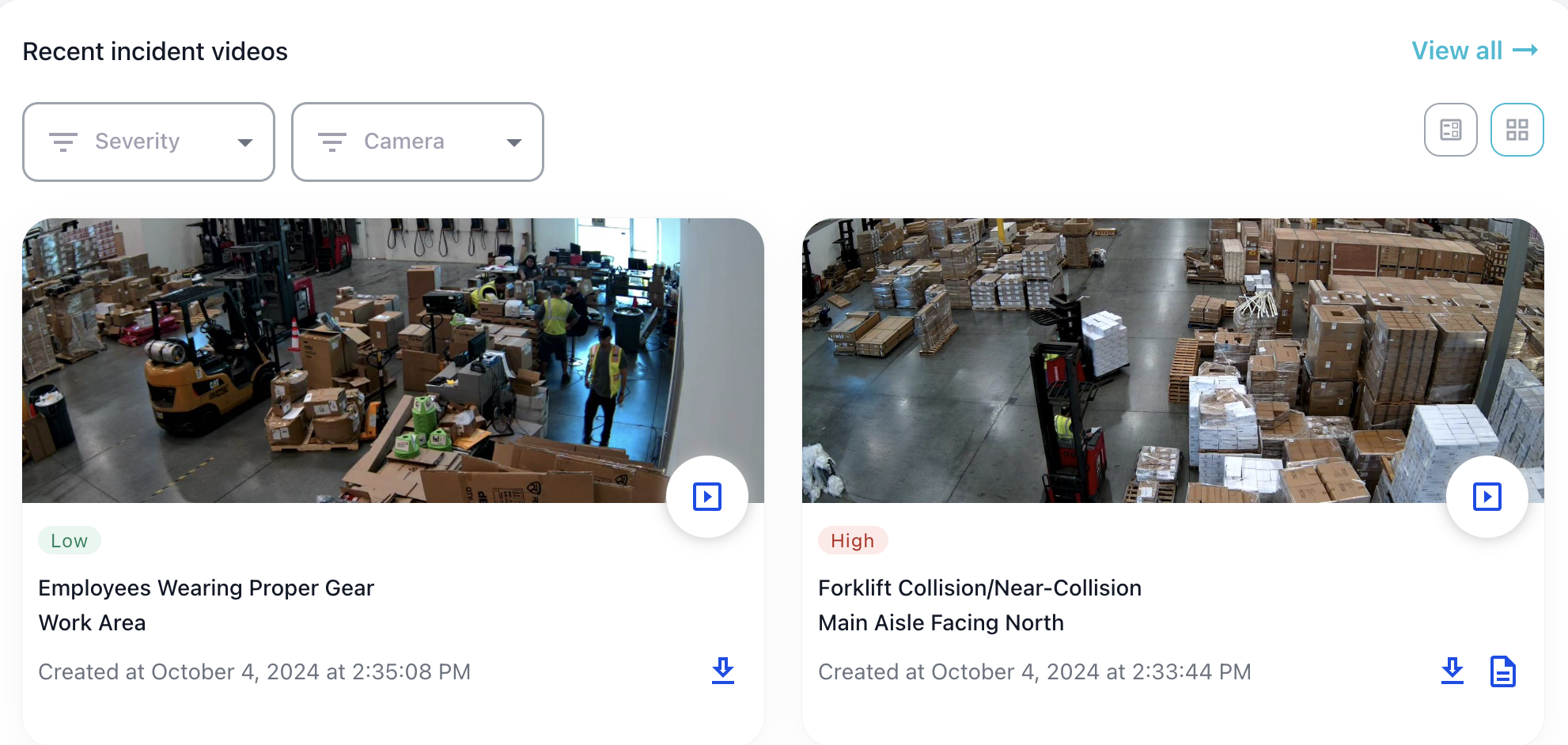
Recent Incident Videos
This section provides a condensed list of the most recent incidents with details including an image of the incident, the severity, the incident name, the location (camera) in which the incident occurred, and the timestamp. Each individual incident report also has the option to view the video and export the video to mp4 (if within the retention period. See Video Retention).
For forklift collision incidents, there is an option to create an incident report for both injuries and near-collisions, using our AI to complete PDFs for report filing based on the incident video. See Incident Reports.
Filter options include filtering by incident severity and incident location (titled "Camera"). To view the comprehensive list of all incidents, click the "View All" link.
Lastly, there are multiple views for this component, displayed in the top right corner: grid/gallery view as well as list/table view.